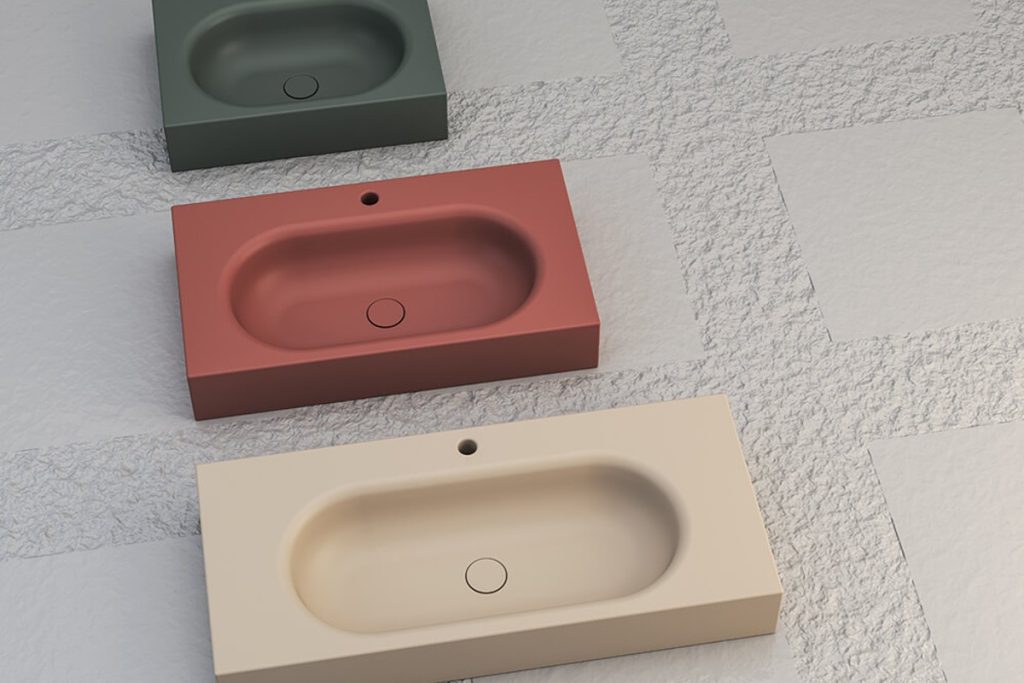
Beige has more range than it gets credit for. Sand, oatmeal, warm ivory and soft taupe can each give a room a different character. The trick is to compare them together, rather than choosing every surface separately.
Start with the largest surface
Your floor will sit beside almost everything else in the room. Choose it alongside a cabinet or timber sample and your wall colour. A beige tile with a pink undertone can look quite different next to yellow-toned oak. Lay the samples flat as well as upright: light hits each position differently.
Create contrast through texture
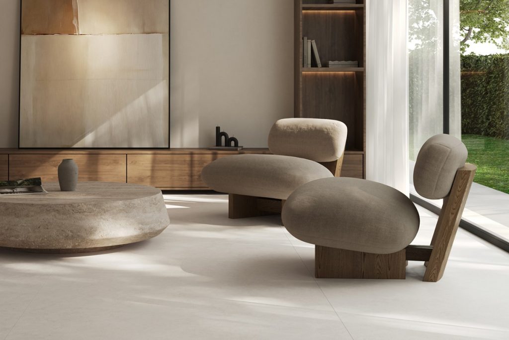
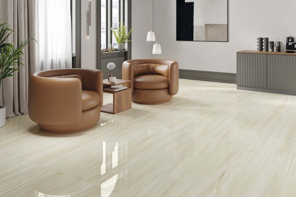
A quiet colour scheme still needs variety. Combine a gently patterned floor with plain walls, timber grain and woven fabrics. If the floor has noticeable movement, let it be the main pattern. This makes a neutral room feel considered without filling it with competing finishes.
Check the evening version
A sample that looks creamy in daylight may look more yellow under warm lamps. View your shortlist in the room at different times, using the lighting you expect to keep. Bring an existing curtain, cabinet or paint sample into the comparison, too.
Discuss your project with G&P Home Store
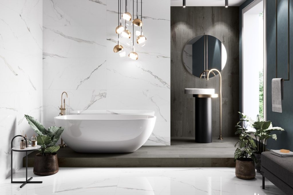
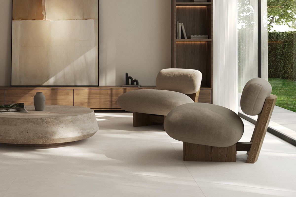
The Azuvi Luna interior pictured here is inspiration for a restrained, layered palette. Bring your room photographs and favourite colours to G&P Home Store to discuss tile options and current availability.
Contact G&P Home Store or call +357 26 812696.