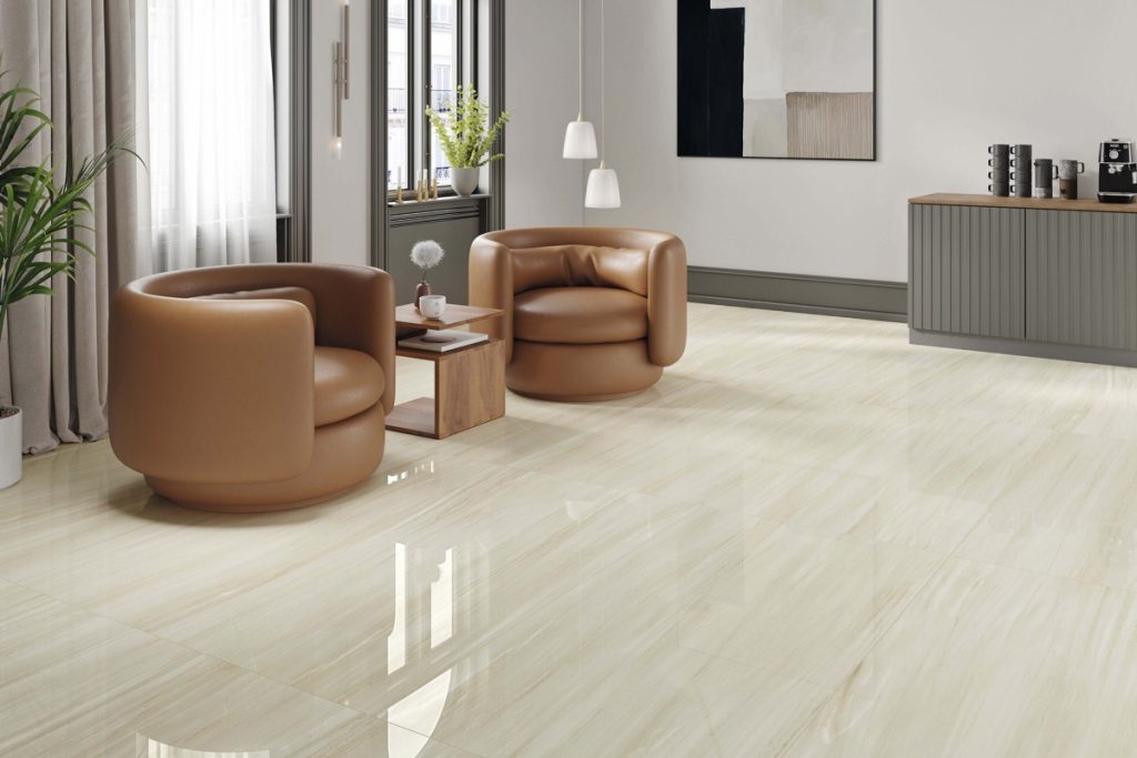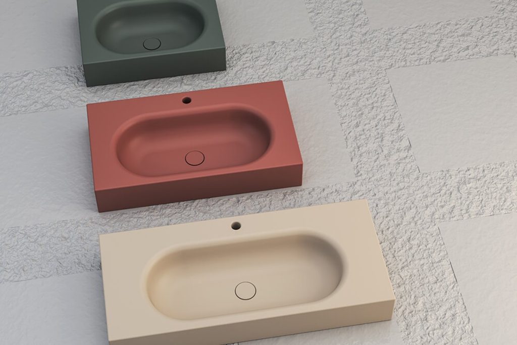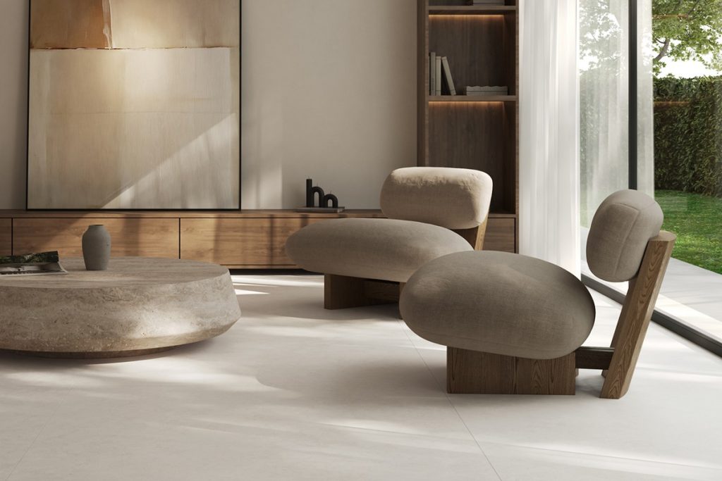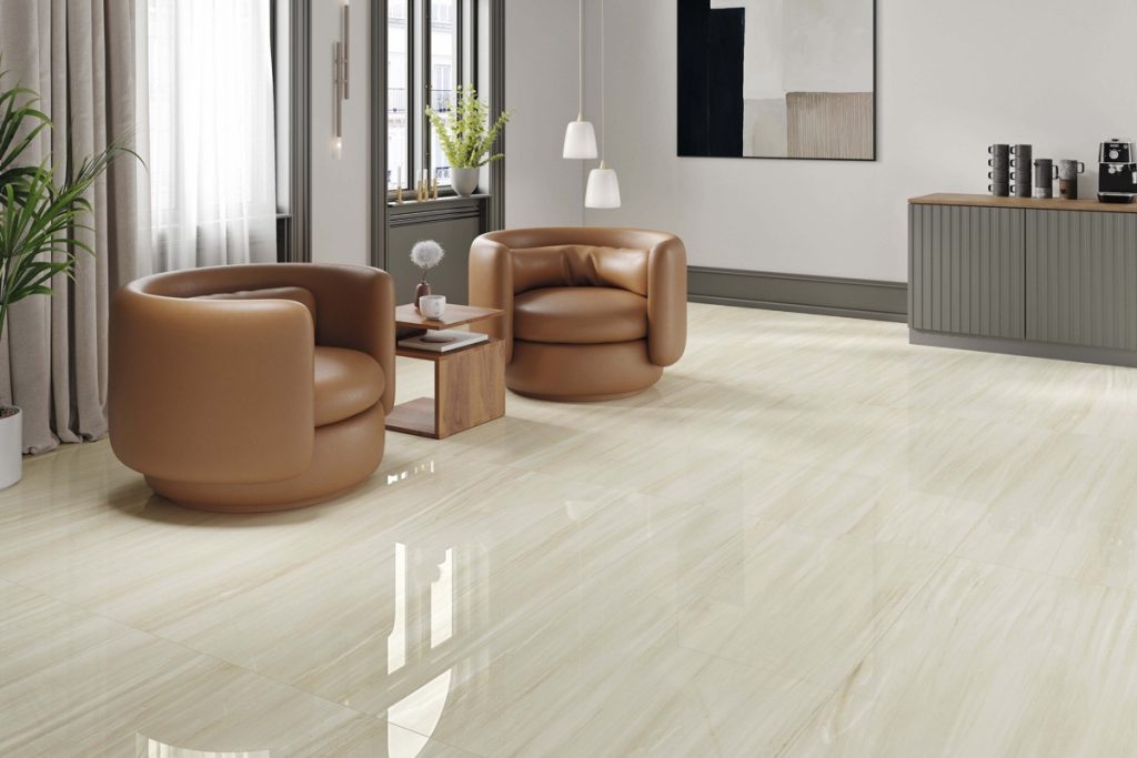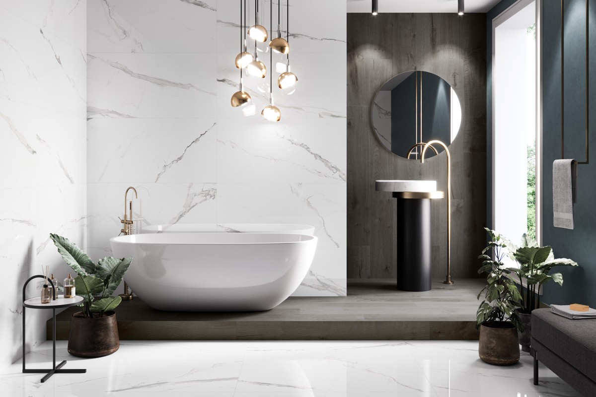
Grout can quietly connect tiles or make every tile stand out. It deserves a place in your material selection, rather than a quick decision on installation day. The same tile can look surprisingly different with two grout colours.
For a quieter surface
A grout close to the tile’s overall colour can reduce visual contrast between pieces. Compare it with the main background tone, not just one vein or fleck. On a varied tile, there may be more than one plausible match, so check the effect across several faces.
For a more graphic layout
A contrasting grout can emphasise the shape and laying pattern. This can suit a deliberate grid or smaller-format tile, but it will also draw attention to the joints. Ask to see a sample arrangement before committing across a large wall or floor.
Choose a suitable product
Colour is one part of the specification. Ask the installer to select grout appropriate to the tile, joint width and location, including any wet-area requirements. Review the manufacturer’s cleaning and curing guidance. Movement joints need their own correct detailing and should not simply be treated as ordinary grout joints.
Discuss your project with G&P Home Store
Bring your chosen tile to G&P Home Store when discussing finishing materials. Agree the grout product and colour with your installer before work starts, and keep a record of the product used for future reference.
Contact G&P Home Store or call +357 26 812696.